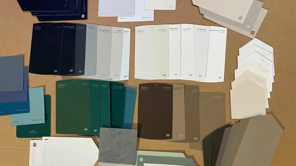
Decorating your home starts with your canvas. How would the Mona Lisa look if the artist had to start with a fuchsia canvas? Do you think Vincent van Gogh would be the highly touted artist he is if the backgrounds of his paintings were white? I don’t think so. And just like every painting, each home is unique and requires its own look to become the masterpiece it is destined to be.
That’s why I think it is so important to talk about paint. Choosing a color can be overwhelming, but when you mix in different brands and finishes it can be a downright formidable task. Hopefully, by the end of this blog, you’ll at least feel a bit more comfortable when selecting the right paint for your home.
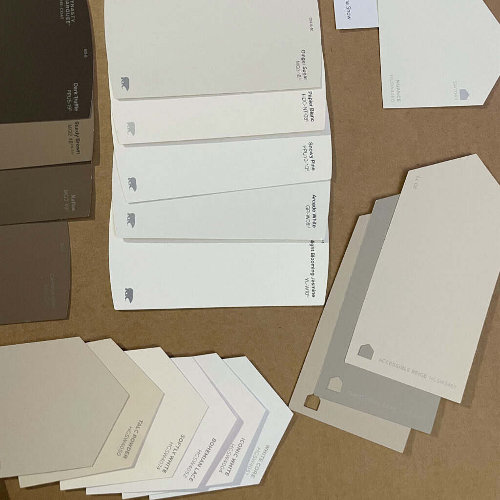
The first thing to know is that not all paint is made the same. Some paint chips, scuffs and seems to fall short of your expectations. There are tens of paint brands out there and I’m sure each one has its flaws, but I would only recommend 3: Sherwin Williams, Behr, and Benjamin Moore. What makes them so special? Well, I’m glad you asked.
Starting with Sherwin Williams, it is the creme de la creme of interior paint colors. Founded 150 years ago, the company has mastered stunning neutrals and is the go-to for trendy shades. Behr, which is exclusively sold at Home Depot, is a (little) less pricey brand with just as much impact. I find that Behr tends to have good neutrals, but superior bold colors. I recently used their Midnight Show color to add a stunning accent wall in my mom’s bedroom. I love the quality and richness of their paint.
Last, but not least Benjamin Moore. They were the first company to create computerized color matching and still sit at the top of the paint game. Their paint is a tad on the pricier end, but you get what you pay for. Benjamin Moore sets the industry standard for a quality product.
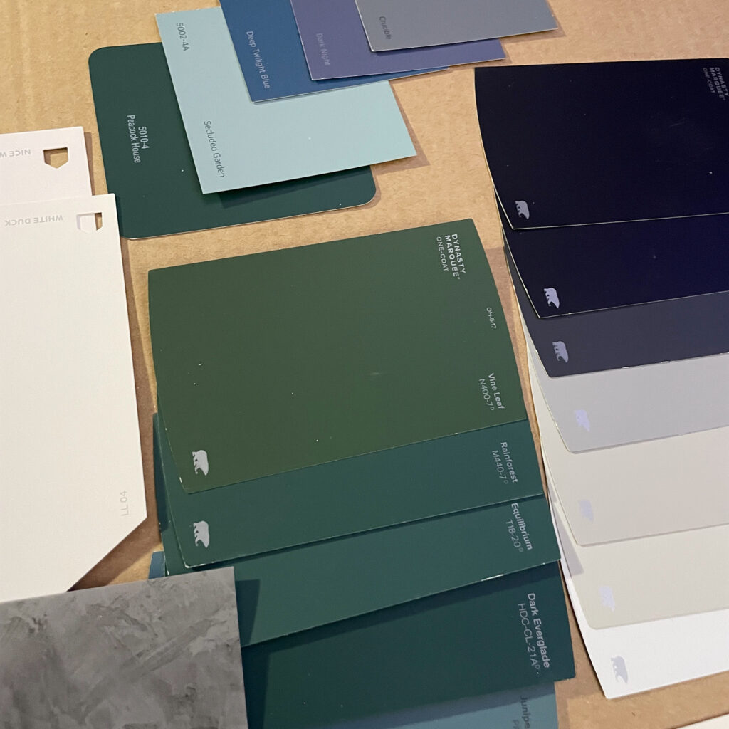
Once you understand your budget and select a brand, then you can start narrowing it down to color. Selecting a color can be a bit of a challenge so I recommend picking an inspiration piece. Find a staple item in your home that you know will stay for a long time. This could be your beloved couch, your kitchen counters, an art piece, or a mood board for what you want your home to be! Once you have that piece bring a sample or photo with you to the store and use it to compare to paint colors that catch your eye.
Now, I am a big fan of utilizing neutrals in your home but I also don’t think you can go wrong with a pop of color! That’s not to say paint every room in your home a different color, but if that’s your thing, more power to you. The one bit of advice I will give is walls can always be repainted, so don’t let anyone tell you “don’t.” I do highly recommend having much of your home painted in a neutral color to allow your furniture and decorations to speak for you, but an accent wall here and there never hurt anyone. Try finding a happy balance, and if you’re having trouble deciding try to stick to a lighter neutral that you can easily paint over later with a fun color.
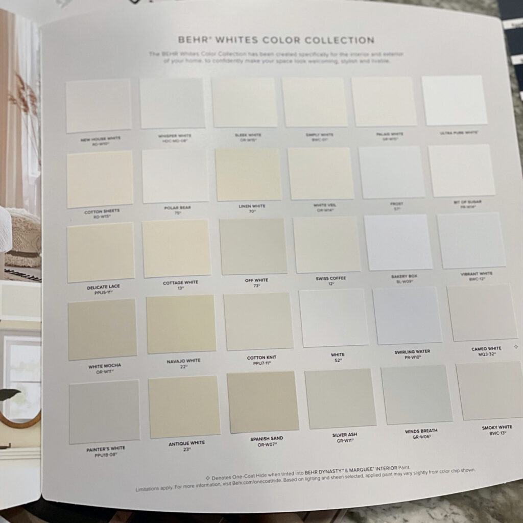
Once you’ve selected a color the rest is easy, right? Yes and no. Choosing a color can be the most challenging part, but there are still a plethora of other decisions to make. If you decide to paint your house white, it’s time to think about undertones. Warm colors have yellow or red undertones, while cool colors have blue or grey undertones. Although 2022 is trending toward warm paint colors, you cannot go wrong with cool either. That is with one caveat, you should be sure to have a mix of both cool and warm undertones in your home.
If most of your furniture and decorations have cool undertones, I recommend warming your home up a bit with a warmer wall color. You will have to mix it up a little with your accent pieces to help tie the tones together, but I promise it will look great. This will also keep your home from feeling too cold or too yellowish.
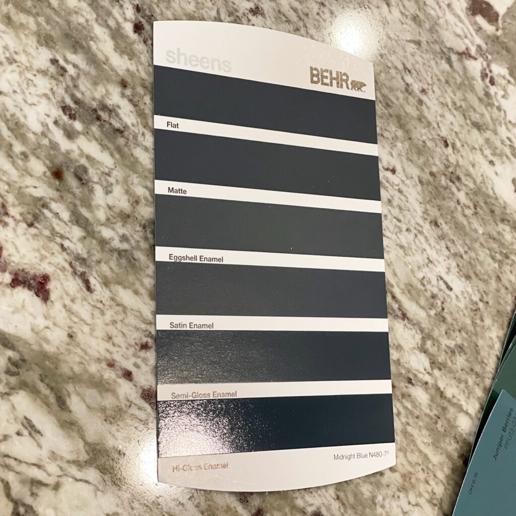
The next and arguably most important element to establish is the sheen. Sheen selection is largely based on the traffic in a particular area and mostly determines how durable your paint will be. For instance, semi-gloss enamel is resistant to moisture, easy to clean, and is highly durable. This makes it perfect for kitchens, bathrooms, cabinets, doors, and trim. Satin enamel is a bit less durable, but still easy to clean and has a less glossy finish which is why it’s often used in hallways, furniture, and kids’ bedrooms.
Then there is eggshell. Often used in a majority of the home, eggshell works best for medium traffic areas such as living rooms and bedrooms. Its ability to cover imperfections and medium durability level also makes it the perfect sheen for accent walls. Matte and flat are a bit of the same in that they’re quite a bit less durable. Matte fits best in adult bedrooms that tend toward lower traffic while flat is truly meant for ceilings.
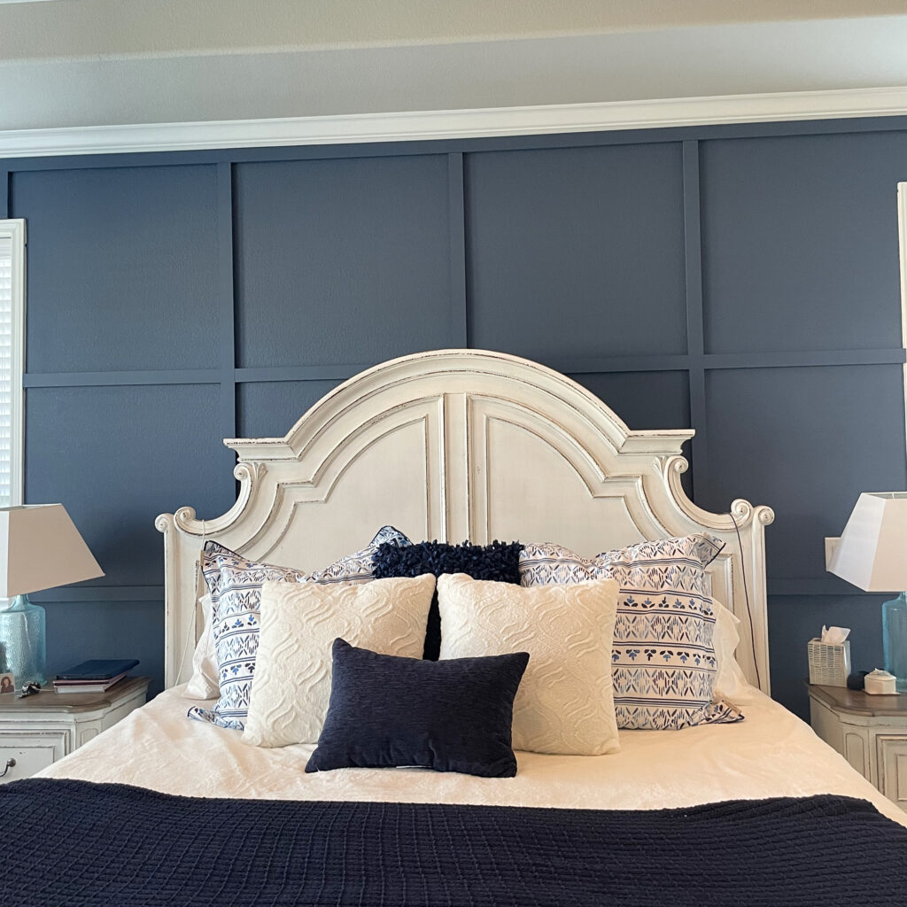
The last factor to focus on when selecting a paint color is lighting. As some of you may know, I recently refreshed my mom’s bedroom with this rich blue accent wall. The main reason this dark color works so well is that her room has a ton of natural light. With 3 large windows spanning the entirety of one wall and 2 on either side of the bed, the room fills with light. Rooms with plenty of natural light can take a darker color well.
If less natural light enters the space, the room can look small and bleak. It’s best to use lighter colors such as whites and light greys if the rooms are small or have less natural light. Lighter colors will help brighten the room naturally and therefore create the illusion the room is larger than it actually is.
I think that is plenty about paint as I don’t want to overwhelm you with anything more for now. If you focus on these five factors, painting will be a breeze. Comment below if you have any questions on which paint to use in your home!

