
Why is it that every room in a magazine or movie feels curated and thoughtful? Even the shabbiest room feels chic and there’s just something about it that makes it look put together. Then you look at the house you’ve spent hours furnishing and decorating. Does it give you that same curated feel?
If not, that’s pretty normal. In fact, most homes you walk into may feel a bit less stylish than any professionally designed space. Why is that, you ask? It’s actually quite simple.
Contents
Curated & Calculated
I could practically go into an in-depth series on creating a curated home. However, I think ultimately there are 3 key concepts to help you create a well-designed space. If you’re able to follow these 3 simple steps, it can help elevate your space. It won’t solve all your design woes, but it will give you a thoughtfully designed space.
3 Keys
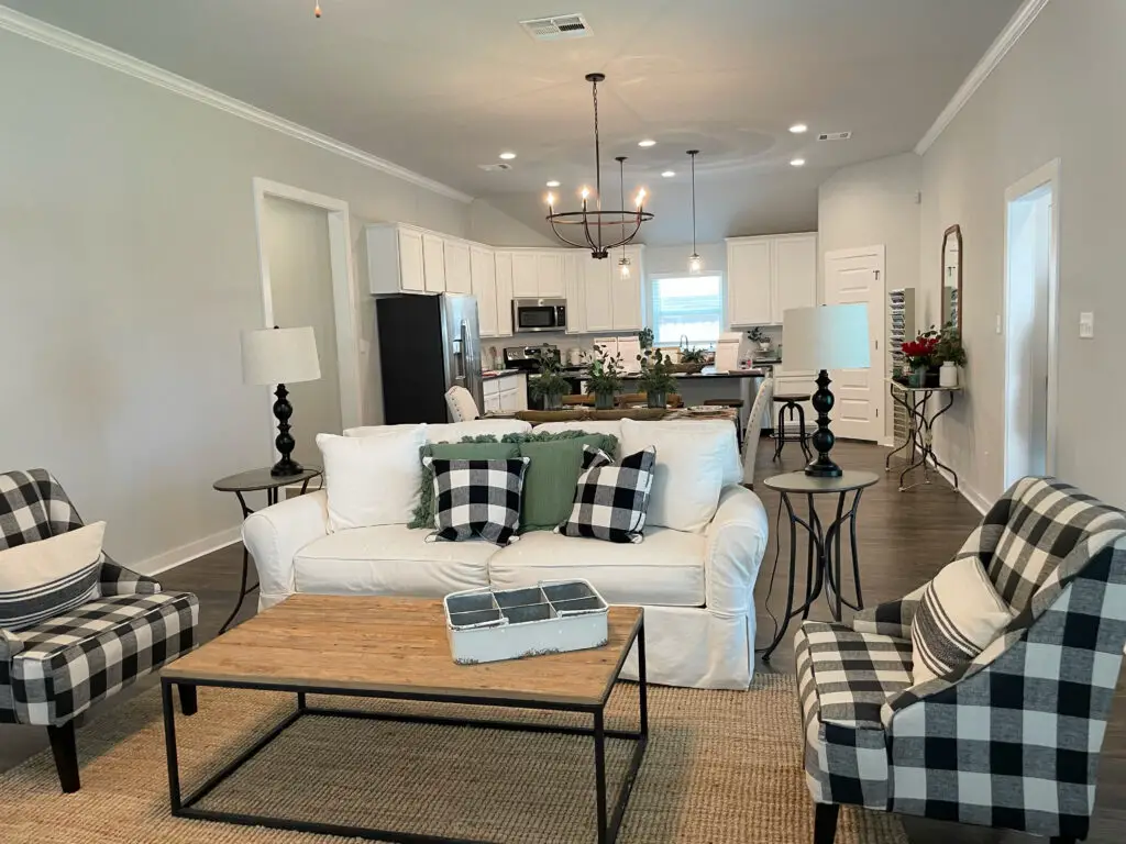
Okay, I’ve left you all hanging on long enough, time to reveal those three keys. If you’re looking for a home to feel more designer then you should look into repeating colors, textures, and/or patterns. You don’t have to repeat all three, one is sufficient, but if you are able to incorporate the three you will have yourself an artfully designed space.
Now, let’s dive into how to do each of these subtly but effectively.
Repeating Patterns

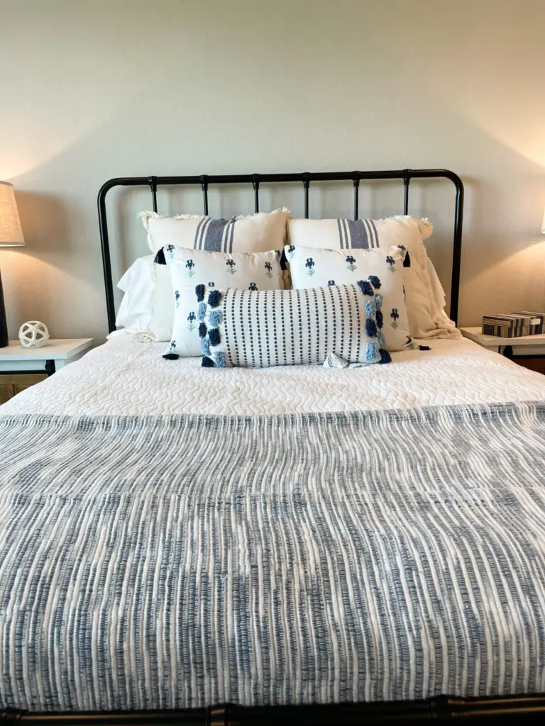
Who doesn’t love a good floral print or a classic stripe? Whether it’s a bold print or a subtle design on your rug, utilize prints in your home to your advantage. Use multiple different color throw pillows and bring them together by tying together their stripes. If you have a beautiful art canvas for your wall, but it doesn’t really match the space, try to find a similar pattern or print to tie into another blanket, pillow, or vase.
By repeating a pattern in various elements in your space, you’ll be able to create that thoughtfully crafted look in whatever space. The good news is you don’t have to find the exact pattern or print, it just needs to give a nice ode to the piece you would like to fit in the space. If you match it exactly, the room will feel more matchy-matchy creating a cheap look versus the designer look and feel you’re going for.
Repeating Colors
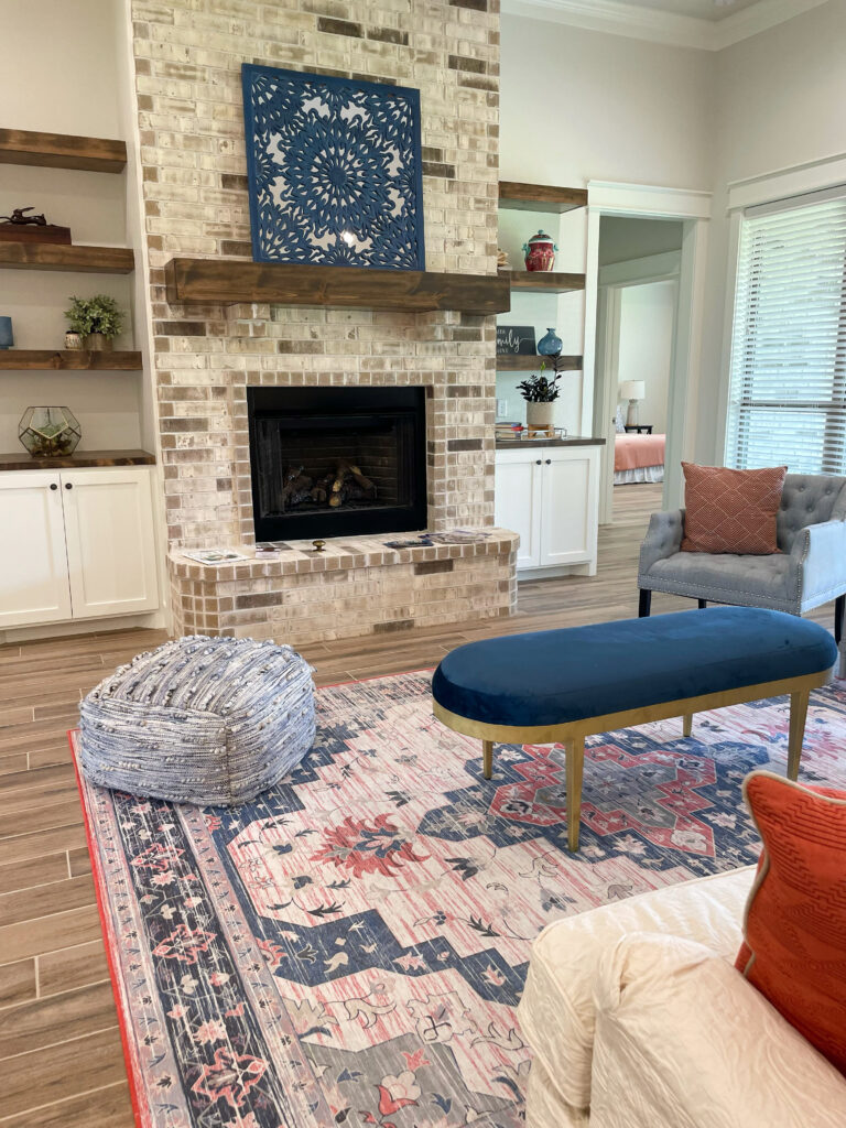
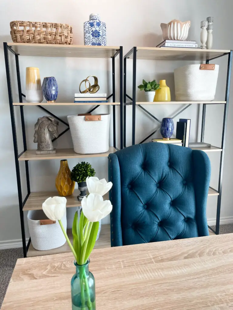
The repetition of colors to make a space feels put together seems rudimentary, but please recognize the importance of doing this right and doing it well. At the basic level, if you have a blue couch and blush accents you can find a blue and blush rug to blend the two colors together. That’s breaking it down to its most simple form, but repeating colors goes deeper than that.
Instead of having just one single shade of blue, incorporate varying shades of blue. Bring in new pieces that tie in one or two other colors from the space. As you know, I always encourage sticking with two to four colors, which can feel a bit one-dimensional if you only stick to one version of each. However, the more you mix and match varying shades of colors, the more high-end your space will feel. Here’s my “pro-tip”: find one piece that incorporates a lot of the colors, whether it’s a rug or painting, and build your other elements off of that using it as a color palette guide for the room.
Repeating Textures
I may have saved the absolute best for last, but it’s also one of the more challenging elements. Textures are probably the most subtle element of the three keys which makes it the most powerful. Unlike colors or patterns, textures may seem a little less obvious to the naked eye which makes it a great way to blend together pieces without making your space feel cookie-cutter.
So how do you do this? Take a living room for example. Instead of matching your throw pillows on your couch to the color of your accent chair, find a material that is similar in texture to your accent chair and use that instead. It’s far less noticeable, yet it still carries a powerful impact. If you’re in a bedroom, the throw blanket doesn’t have to be the same color or pattern as the pillows as long as one of the pillows incorporates a similar texture.
Don’t just stop at fabrics though. You can use this same concept with various metals too. If your coffee table has metal legs, find candlesticks in the same metal or texture. These small, subtle hints help to create a more curated and high-end design without screaming “I match.”
